Home Wall Ideas: A Room-by-Room Guide to Wall Decor That Fits
A blank wall is easy to ignore and surprisingly hard to get right. Most rooms fall into one of two traps: the wall stays empty for years, or a single small frame goes up dead center and never quite looks finished. Wall decor sits in a useful middle ground. It changes how a room feels without the cost of new furniture or the disruption of a renovation, and most of it can be swapped out later when your taste shifts.
People are clearly putting money into this. Grand View Research estimates the global home decor market was worth roughly USD 960 billion in 2024 and projects it to reach about USD 1.6 trillion by 2030, with wall art counted as part of that mix (Grand View Research). The good news is that the pieces that make the biggest difference are rarely the most expensive ones. What matters more is planning the wall, hanging things at the right height, and choosing decor that suits the room instead of fighting it.
This guide walks through how to read a wall before you buy anything, the single measurement that quietly prevents most mistakes, a range of ideas explained with the reasoning behind them, room-by-room pointers, and the errors worth avoiding.
Read the Wall Before You Buy Anything
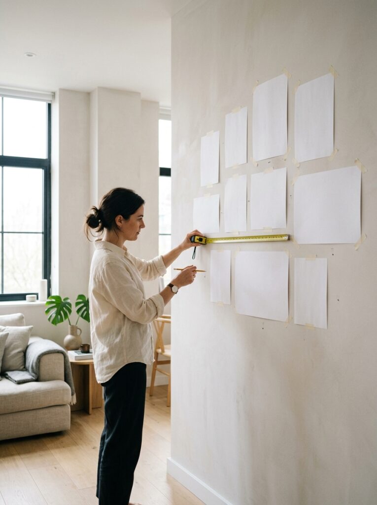
The most common reason a wall looks off is that the decor was chosen before the wall itself was understood. Before shopping, look hard at three things: size, light, and the job the wall does.
Measure the space you can actually use, not the whole wall. A sofa, a bed, or a low console takes up part of that area, and decor relates to the furniture beneath it far more than to the ceiling above it. Then pay attention to the light. A wall that catches hard afternoon sun will throw glare across glass frames and glossy prints, which is worth designing around rather than discovering later. Finally, decide the wall’s role in the room. One wall can carry a bold focal piece while the others stay calm. Turning every wall into a statement usually reads as clutter.
A quick habit saves a lot of unnecessary holes. Cut paper or newspaper to the size of the pieces you are weighing and tape the shapes to the wall. Live with them for a day. If the arrangement still looks right the next morning, you are ready to commit.
The One Measurement That Fixes Most Wall Decor
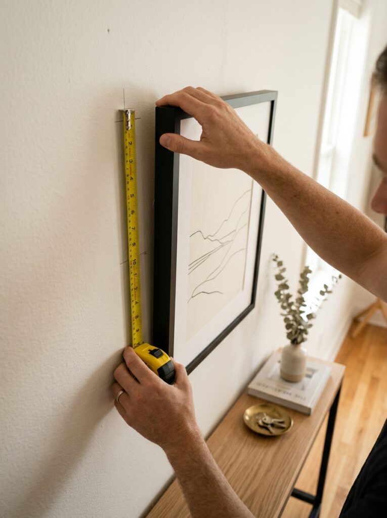
If you remember nothing else here, remember this. Hang art so the center of the piece sits about 57 inches from the floor. That figure lines up with average adult eye level and is the same reference galleries and museums use, which is why a room hung to a consistent center reads as deliberate rather than random (Apartment Therapy). Plenty of designers treat 57 to 60 inches as a comfortable working range.
Two adjustments matter in real rooms. When art hangs above furniture, the gap to the furniture matters more than the eye-level rule. Leave roughly 6 to 8 inches between the top of the sofa or console and the bottom of the frame so the two feel connected instead of drifting apart (Artfully Walls). For a gallery wall, treat the entire grouping as one object: find the group’s center, place that at eye level, and keep about 2 to 3 inches between frames (The DIY Playbook).
The error this prevents is the most widespread in home decorating: hanging things too high. Art floating near the ceiling looks stranded and cut off from everything below it, and lowering it is often the single change that makes a wall click.
Wall Decor Ideas, and Why Each One Works
Plan a gallery wall instead of improvising one
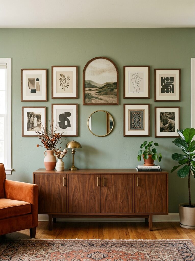
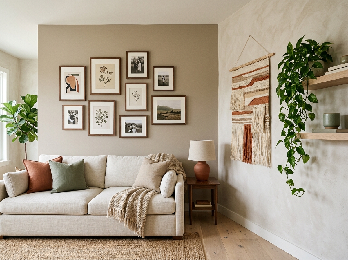
A gallery wall goes wrong when frames go up one at a time and the layout grows by guesswork. It works when you design the whole shape first. Lay the pieces out on the floor, or trace them onto paper templates, and shuffle them until the grouping feels balanced. Odd numbers of pieces tend to look more relaxed than a strict even grid, though a tight, symmetrical grid has its own crisp appeal. A popular current move is to combine curved or arched frames with rectangular ones in the same grouping, which adds rhythm without breaking the balance (BIG Wall Decor). Keep the spacing even and the group’s center at eye level, and even a wall of mismatched frames will feel intentional.
Let one oversized piece carry the room
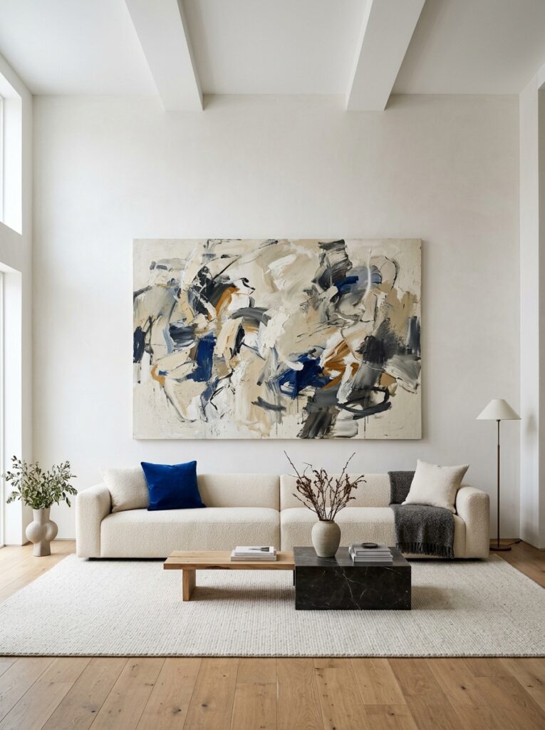
Small art on a large wall is the visual version of a whisper in a big room. When a wall feels bare, a single large piece often fixes it more effectively than a scatter of small ones. Scale it to the furniture: above a sofa, a piece spanning roughly two-thirds of the sofa’s width looks properly anchored. A single large work is also easier to hang, easier to light, and calmer to live with than a busy grid.
Add texture you can feel
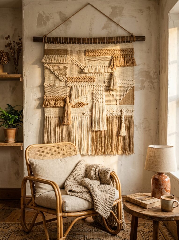
Flat, glossy surfaces are giving way to tactile ones. Woven hangings, macramé, raised-plaster and limewash finishes, and textured wallpaper all add a depth that a flat print cannot. This matches where interiors are heading. Decor commentators describe the current direction as a shift toward surfaces that invite touch and feel handmade rather than mass-produced (BIG Wall Decor). A single woven piece or a strip of textured wallpaper introduces warmth fast, and it works especially well in rooms that already have a lot of hard, shiny surfaces.
Bring nature onto the wall
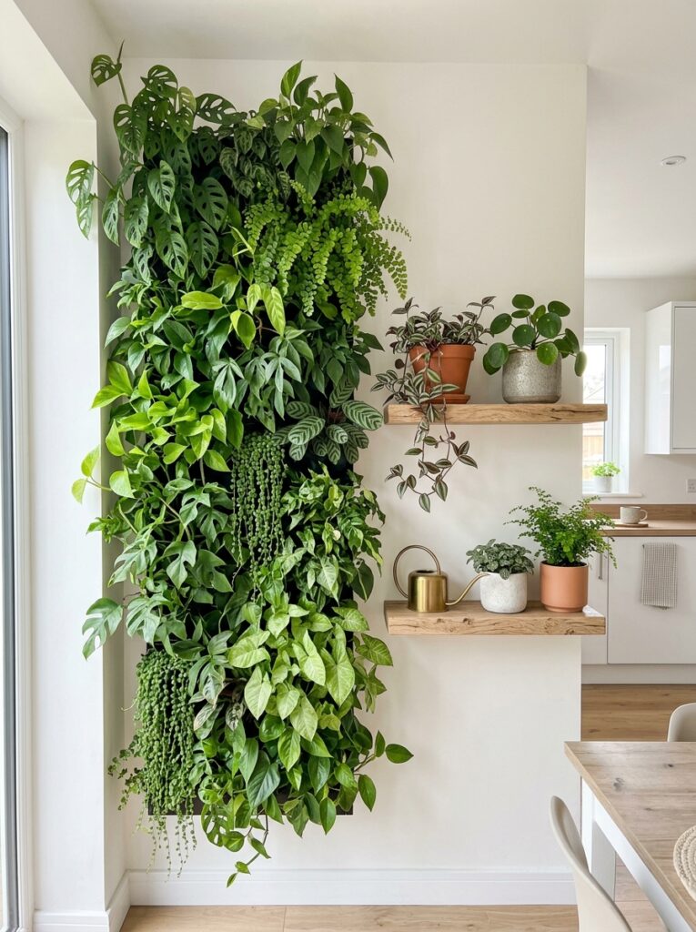
Plants on and around a wall do more than fill space. Peer-reviewed research links indoor greenery to lower stress and a better read on the space itself. One mixed-methods study found that indoor plants improved people’s perception of air quality and reduced stress, though it sampled gardening enthusiasts, so the effect may not apply to everyone equally (Emerald Publishing). Broader reviews of biophilic design report that adding natural elements indoors is associated with reductions in physiological stress markers such as heart rate and blood pressure (NIH / PMC). In practice, this can be as simple as a row of trailing plants on a floating shelf, or as involved as mounted planters and a full living wall. If you would rather skip the upkeep, botanical prints and nature-referencing art carry a similar sense of calm.
Use mirrors to borrow light and space
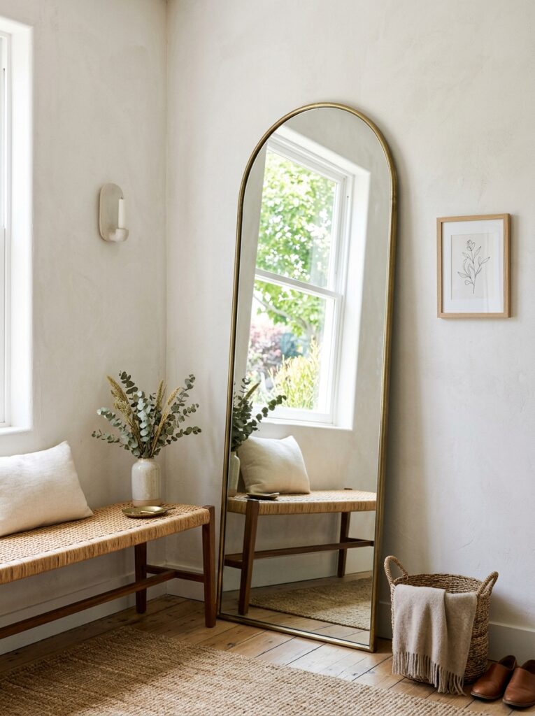
A mirror is decor that also earns its keep. Placed across from or near a window, it bounces daylight deeper into the room and makes a small space feel larger. A big mirror leaned against the wall behind a console looks relaxed and modern, while a framed mirror can anchor a wall the way a piece of art would. In tight entryways and hallways, a mirror opens up a space that would otherwise feel closed in.
Install picture ledges for a display you can change
Nailing frames in place locks you into one layout. Narrow picture ledges let you lean and layer art, then rearrange it whenever the mood strikes. Overlap a larger framed print behind a smaller one, add an object or a small plant, and rotate pieces with the seasons. Ledges are forgiving for renters and for anyone still working out what they actually want on the wall.
Treat paint and color as decor in their own right
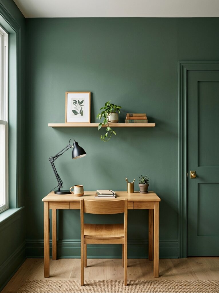
Sometimes the wall itself is the decor. A single painted accent wall, or color carried up from the walls onto the trim for a wrapped, enveloping effect, changes a room with nothing but a few cans of paint. Color also shapes mood. Cooler tones such as blue and green tend to read as calm and are common in bedrooms and quiet rooms, while warm reds, oranges, and yellows feel more energizing (Sherwin-Williams). Response to color is partly personal and cultural, so paint large swatches on the actual wall and check them in daylight and at night before committing. For a current reference point, several major paint brands built their 2026 colors of the year around grounded, nature-referencing tones, including Behr’s jade “Hidden Gem” and Valspar’s “Warm Eucalyptus” (Composite Panel Association), Benjamin Moore’s espresso “Silhouette” (Benjamin Moore), and Pantone’s soft white “Cloud Dancer” (Design News Now).
Renter-friendly ideas that leave no marks
Decorating a wall does not require a drill. Peel-and-stick wallpaper covers a surface and peels away without damage. Removable adhesive hooks and strips hold lighter frames securely. Leaning art on the floor or a ledge skips the wall entirely, and tension-mounted display systems show off pieces without a single hole. Options like these make it realistic to decorate a rental fully and reset it cleanly when you move.
Matching Wall Decor to Each Room
Living room. This is usually the focal-wall room. Anchor it with one large piece or a planned gallery wall above the sofa, keeping the bottom of the art about 6 to 8 inches above the back cushions so it stays tied to the seating.
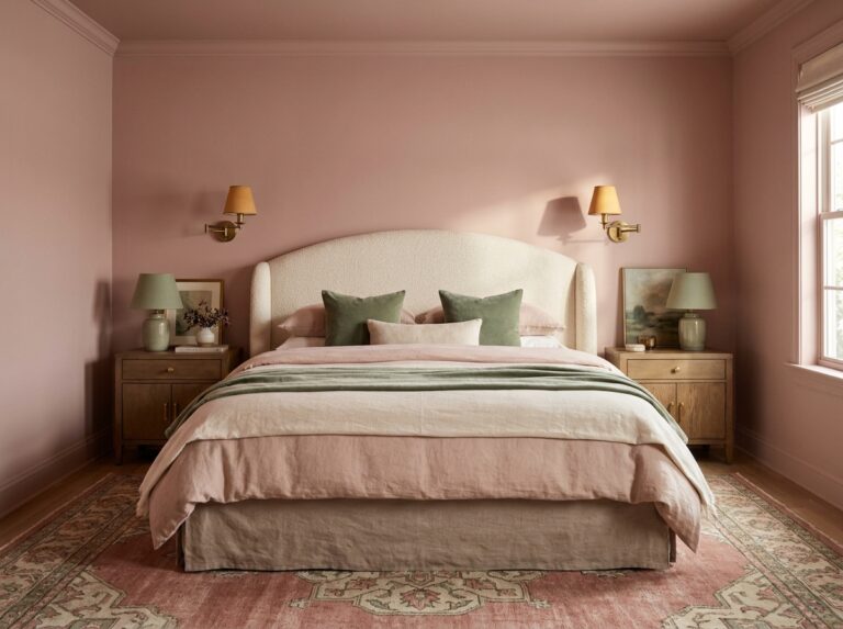
Bedroom. Lean toward calm. The wall above the headboard is the natural focal point, so center art there and keep it connected to the headboard rather than floating high. Softer, cooler colors suit a room built for rest.
Home office. With hybrid and remote work now a lasting pattern, the wall behind your desk doubles as a backdrop for video calls. Keep it uncluttered, and consider cooler tones, which are often chosen for spaces meant for focus.
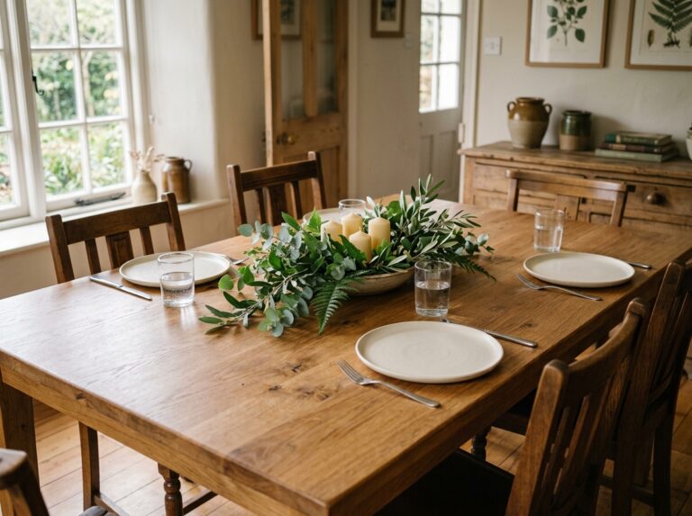
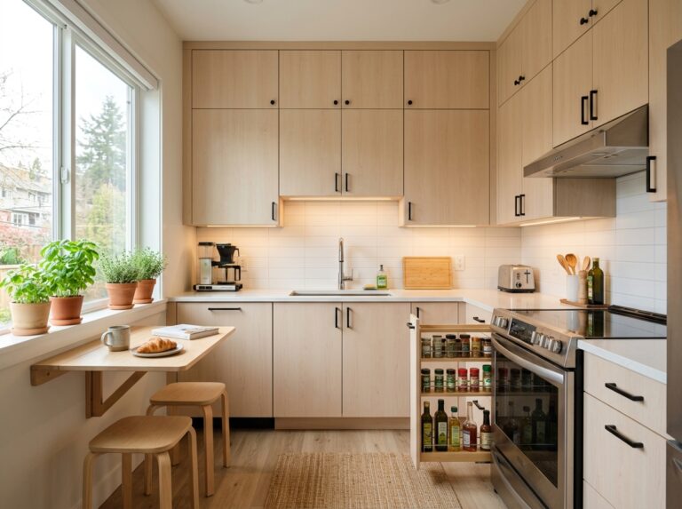
Kitchen and dining. Kitchens take art better than people expect, as long as the piece can handle heat and moisture near the stove and sink. In dining rooms, hang work a little lower than usual so it reads well to seated guests.
Hallways and entryway. Narrow spaces reward a mirror or a linear run of evenly spaced frames. An entryway mirror is practical and makes a tight space feel open.
Bathroom. Humidity rules out delicate originals, but framed prints under glass, small mirrors, and moisture-tolerant pieces hold up well.
Kids’ rooms. Choose decor that is easy to change as they grow. Ledges, removable decals, and lightweight framed prints let the room evolve without a full redo.
Common Wall Decor Mistakes, and Easy Fixes
Hanging too high. Bring the center down to around 57 inches, or keep the art 6 to 8 inches above the furniture below it.
Art that is too small for the wall. Size up, or cluster smaller pieces into one arrangement so they behave as a single larger shape.
No breathing room. Filling every wall flattens a room. Let some walls stay quiet so the decorated ones can stand out.
Ignoring the furniture line. Art should relate to the sofa, bed, or console beneath it, not hover on its own well above it.
Forgetting the light. Glossy frames opposite a bright window create glare. Move the piece, or switch to matte finishes and non-reflective glass.
Everything matching everything. Perfectly coordinated frames and colors can look flat. A little contrast in frame style, size, or finish brings the wall to life.
A Simple Way to Start This Weekend
Pick one wall. Measure the open space, cut paper to the size of the pieces you are considering, and tape the shapes to the wall. Step back, adjust, and leave them up for a day. When the layout still looks right the next morning, mark your hanging points using the 57-inch center as your guide, and put the pieces up. Starting with a single wall keeps the project small enough to actually finish, and thoughtful wall decor on one well-planned wall does far more for a room than a handful of pieces spread thin across four.