Pink Bedroom Ideas: How to Use Pink Without It Feeling Childish
Pink has outgrown its old reputation as a color reserved for little girls’ rooms. In current bedroom design it shows up as dusty rose, blush, and mauve, closer in feel to a boutique hotel than a toy aisle. What separates a pink bedroom that looks refined from one that feels juvenile really comes down to three decisions: which pink you pick, how much of it you use, and what you pair it with. This guide works through all three, along with a genuinely researched side question that most decorating articles skip: whether pink actually calms you down.
Not All Pinks Are the Same, and the Shade Decides Everything
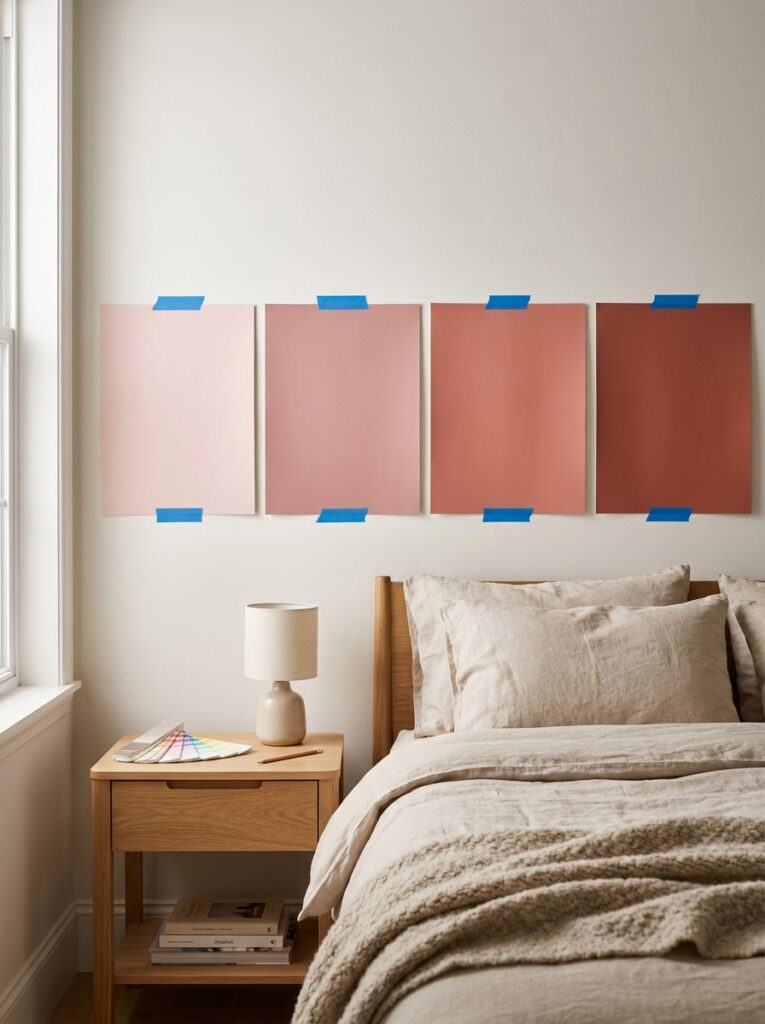
The most important choice you will make is the exact pink, not pink in general. Two rooms painted “pink” can feel worlds apart depending on the undertone.
Blush sits closest to neutral. It reads warm and behaves almost like a warm white, which makes it the lowest-risk place to start, since it rarely announces itself as “a pink room” at all, as Bedsure notes. Dusty rose has grey and brown in its base, which pulls it cooler and more grown-up. It’s the warm-pink-with-a-quality-of-age that reads romantic rather than sweet, and it’s become one of the defining bedroom shades of recent years, according to Asthetic Decor. Mauve leans a step toward lilac, slightly cooler again, with a softer and dreamier feel. Push warmer and you reach terracotta or salmon pink, an earthy, cocooning tone that looks especially good against woven textures and matte ceramics. Go deeper still and plum-pink or deep rose turns dramatic and enveloping at night while still reading refined in daylight.
Then there is bright, baby, or bubblegum pink. It carries a lot of energy, but in any large dose it’s the shade most people are actually trying to avoid, so it works best in small accents rather than across a wall.
One habit prevents most mistakes here: figure out whether your chosen pink is warm or cool before you commit. Clashing undertones, a cool pink fighting warm wood or a warm pink beside cool grey, are usually what make a scheme feel slightly off without an obvious reason.
Decide How Far You Want to Take It
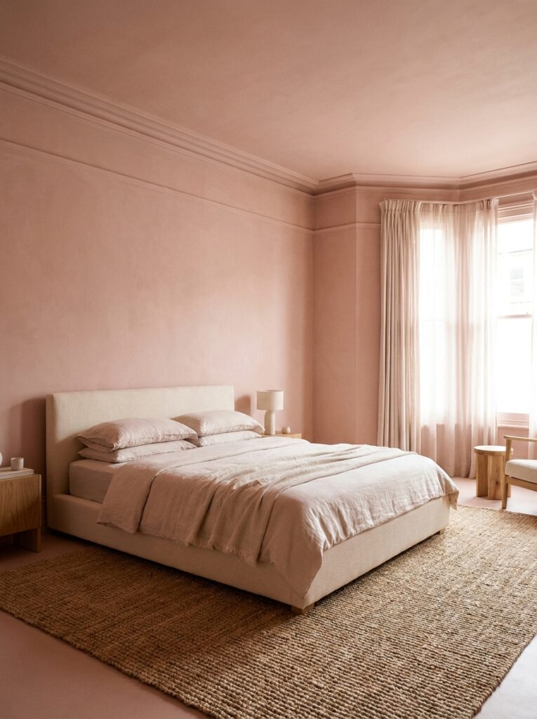
Pink can play anything from a quiet supporting role to the whole identity of the room. Picking your level of commitment early keeps the result coherent.
At the lightest touch, pink lives only in the textiles: a duvet, a throw, a couple of cushions. This is the easiest version to change your mind about later. A step up is treating pink as an accent, a headboard wall, a run of curtains, or painted molding. The fullest version wraps the room in a single tonal pink across the walls, ceiling, and trim. This is how modern rooms increasingly use pink as an architectural color rather than a small decorative accent, building the whole atmosphere around it, as Homedit describes. There is also a quieter fourth option: letting a muted blush stand in for beige or white as the room’s actual neutral, so pink becomes the calm backdrop instead of the statement.
Whatever level you choose, test large swatches on the real wall and look at them in both daylight and lamplight. Pink shifts more than most colors as the light changes, and a shade that looks chalky at noon can turn peachy or grey after dark.
The Pairings That Make Pink Look Deliberate
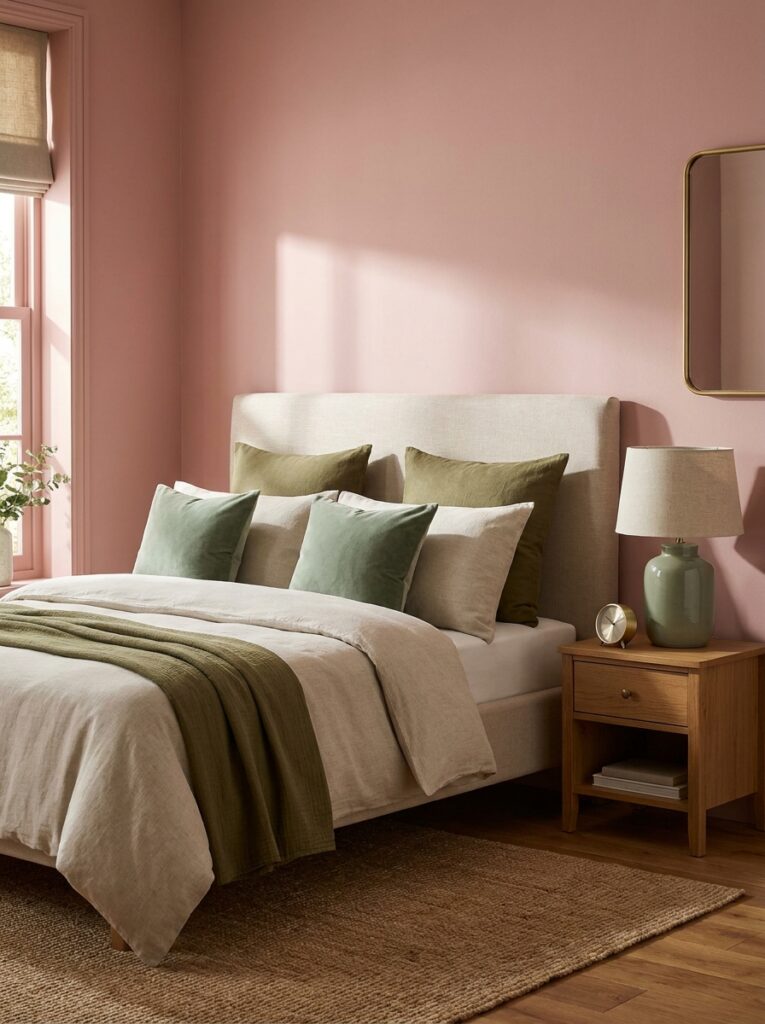
Pink almost never fails on its own. It fails when it has nothing to balance it. The right second and third colors are what make a pink bedroom read as a considered design rather than a default.
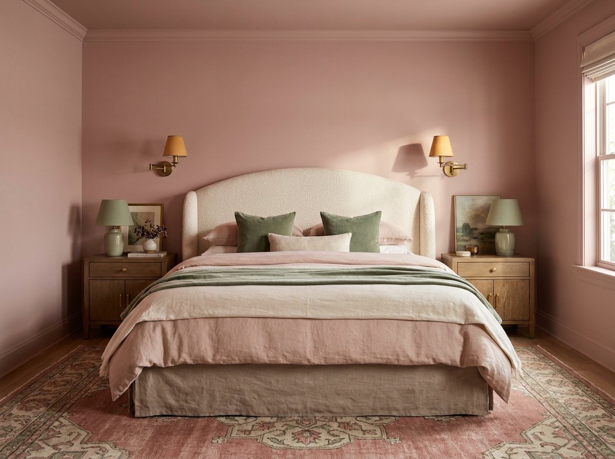
Pink and green is the classic for a reason. Green sits opposite red on the color wheel, and since pink is a lighter version of red, the two balance each other naturally. Sage with blush or olive with dusty rose reads fresh and immediately grown-up, and Bedsure lists blush with warm white and sage as one of its go-to combinations. Pink and warm neutrals, oatmeal, greige, warm white, or charcoal, is the safest sophisticated base of all, letting the pink read as intentional instead of loud. Pink and one darker grounding tone does something similar with more drama: introduce a single deeper anchor like navy, forest green, or chocolate brown and a blush room suddenly feels elevated and confident, a trick The Coolist leans on. With Pink and brass or gold brings a warm metallic glow; dusty rose walls beside cream upholstery and brass lighting is one of the defining looks of the moment, per Asthetic Decor. For something sharper, pink with black or charcoal creates a crisp, modern contrast that reads distinctly adult. And tonal pink layering, moving from blush through dusty rose to a deeper terracotta, builds depth in a monochromatic room without any clutter.
Two combinations are worth actively avoiding. Piling on pink everywhere, and setting pink against a pure bright white, both crank up the saturation and tip the room back toward juvenile, which Bedsure flags as the main mistakes to skip.
Does Pink Actually Calm You Down?
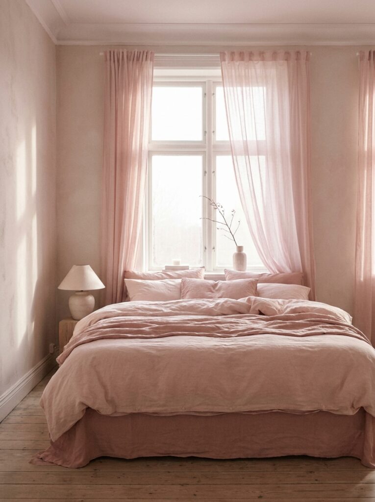
This is where pink gets genuinely interesting. In 1979, research scientist Alexander Schauss reported that a specific bright pink, later named Baker-Miller pink and nicknamed “drunk tank pink,” reduced aggression when used in a naval correctional facility, with a calming effect appearing after roughly fifteen minutes and lasting about half an hour, as Apartment Therapy recounts. The idea spread quickly, and pink holding cells turned up in jails and hospitals.
The catch is that the science never fully held up. Later research has been mixed: a 2014 study was unable to reproduce the aggression-reducing effect, and controlled university studies found effects that were statistically real but small in magnitude, according to NeuWrite San Diego. There is also a twist worth knowing: the shade in those experiments was a bright bubblegum pink, not the muted dusty tones most designers favor today, so the research does not really endorse the sophisticated pink you would actually paint a bedroom.
The honest takeaway is simple. Do not expect paint to substitute for good sleep habits, but there is no harm in choosing a soft pink because it feels soothing to you. With color, personal preference and association carry as much weight as any lab result.
Matching Pink to the Feeling You Want
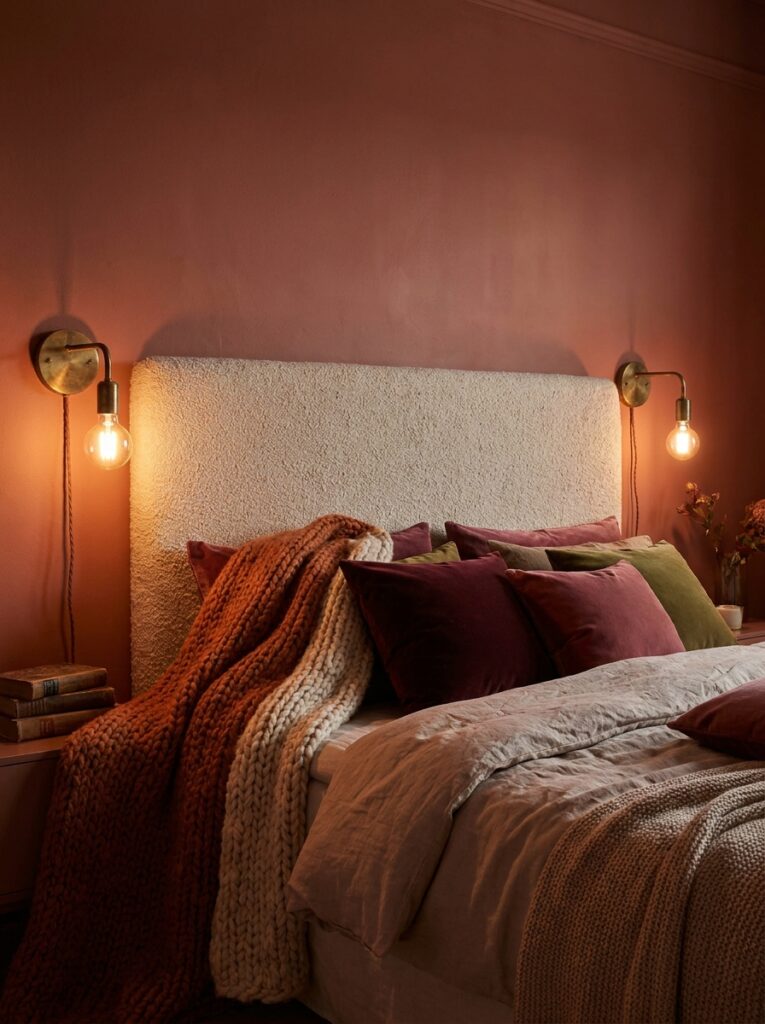
Once the shade, amount, and pairings are settled, the styling is what locks in a specific mood.
For a restful sanctuary, lean on muted, slightly cool pinks like dusty rose or mauve, keep the bedding in warm neutrals, and use soft, layered lighting rather than one bright overhead. Something cozy and cocooning, take a warm terracotta or deep rose onto the walls and pile on texture, knit throws, velvet cushions, wool rugs, warmed up with a little brass. For boutique-hotel polish, pair dusty rose walls with cream upholstery, a scalloped or curved headboard, and tailored fabrics. A boho or Scandinavian feel comes from blush walls with natural wood, linen, and plenty of breathing room in white space. And if you want playful without childish, keep the room mostly neutral and let a few saturated pink pieces, a lamp, a print, a single cushion, carry all the color.
Getting Started Without Guesswork
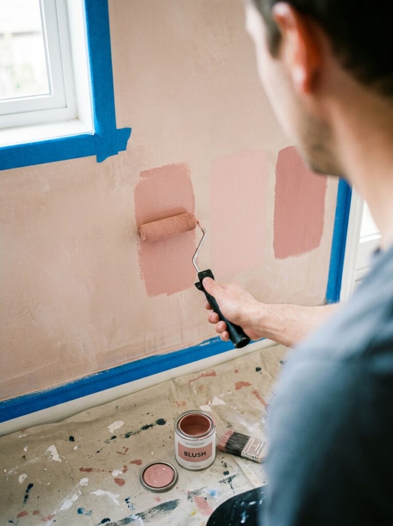
Start small and let the room tell you where to go. Pick two or three candidate pinks, buy sample pots or peel-and-stick swatches, and paint generous patches on the wall beside the bed. Live with them for a full day, checking how each looks in morning light and under lamplight at night. If committing to a full pink wall feels like a leap, begin with the bedding and one accent, then build outward from there once you trust the shade. Approached this way, a pink bedroom ends up looking collected and intentional, which is exactly what separates the grown-up version from the bubblegum one.